上海晨光文具股份有限公司是一家整合創意價值與服務優勢,專注于文具產業的綜合文具公司。晨光文具致力于提供高性價比的文具用品,產品涵蓋書寫工具、學生文具、辦公文具及其他相關產品四大領域。晨光文具是國內文具第一品牌。截至2013年12月31日,公司已擁有“4 大類,45個品項,1,900 余品種” 的文具產品系列,文具產品線的廣度和深度均位居國內前列。
品牌標志及釋義: 晨光是早晨的陽光,旭日初升,它代表著希望、活力和勇氣。 M&G是晨光文具的英文商標,紅色“M”是中國紅,代表晨光源于中國,不斷從中國優秀文化中吸收養分;黑色“G”是國際黑,代表晨光將立足世界舞臺,向世界傳播中國文化! 英文名稱:Shanghai M&G Stationery Co., Ltd
客戶:M&G 晨光文具
項目內容:VI設計 / 視覺管理咨詢 / 產品包裝設計
創作時間:2019年09月14日
挑戰
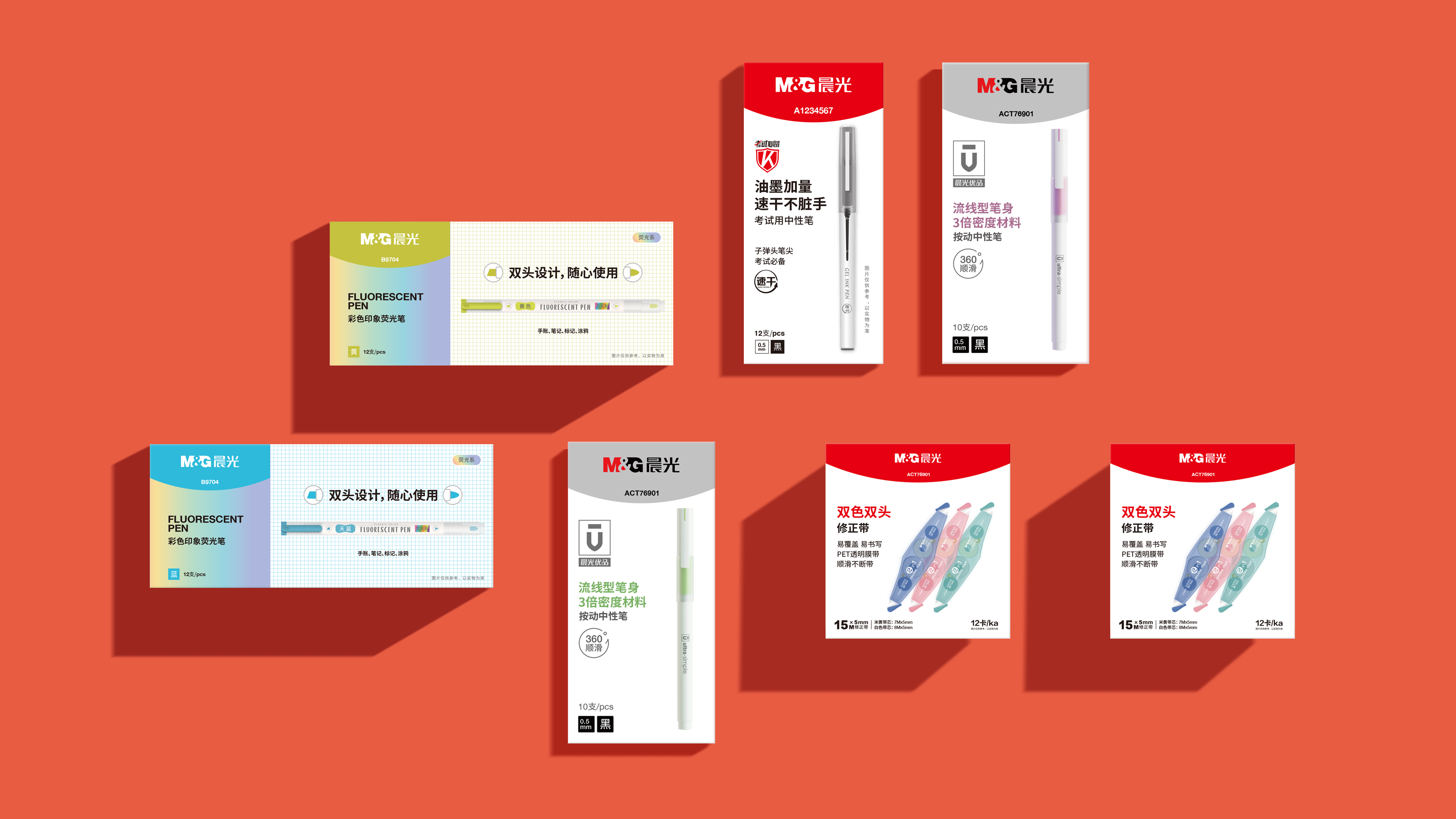
作為深受中國消費者喜愛的民族品牌,晨光正在開創一條中國文具的創新之路,完成從中國制造向中國創造的華麗蛻變,在這個關鍵時期,全國幾萬家門店的混亂,幾萬個現存包裝SKU和推廣系統的混亂對品牌造成了很大的干擾,整合品牌視覺顯的尤其重要。
Challenge
As a national brand loved by Chinese consumers, M&G is creating a road of innovation for Chinese stationery, completing the magnificent transformation from Made in China to Created in China. In this critical period, the chaos of tens of thousands of stores nationwide, the confusion of tens of thousands of existing packaging SKUs and promotion system has caused great disturbance to the brand, and the integration of brand vision is particularly important.
策略
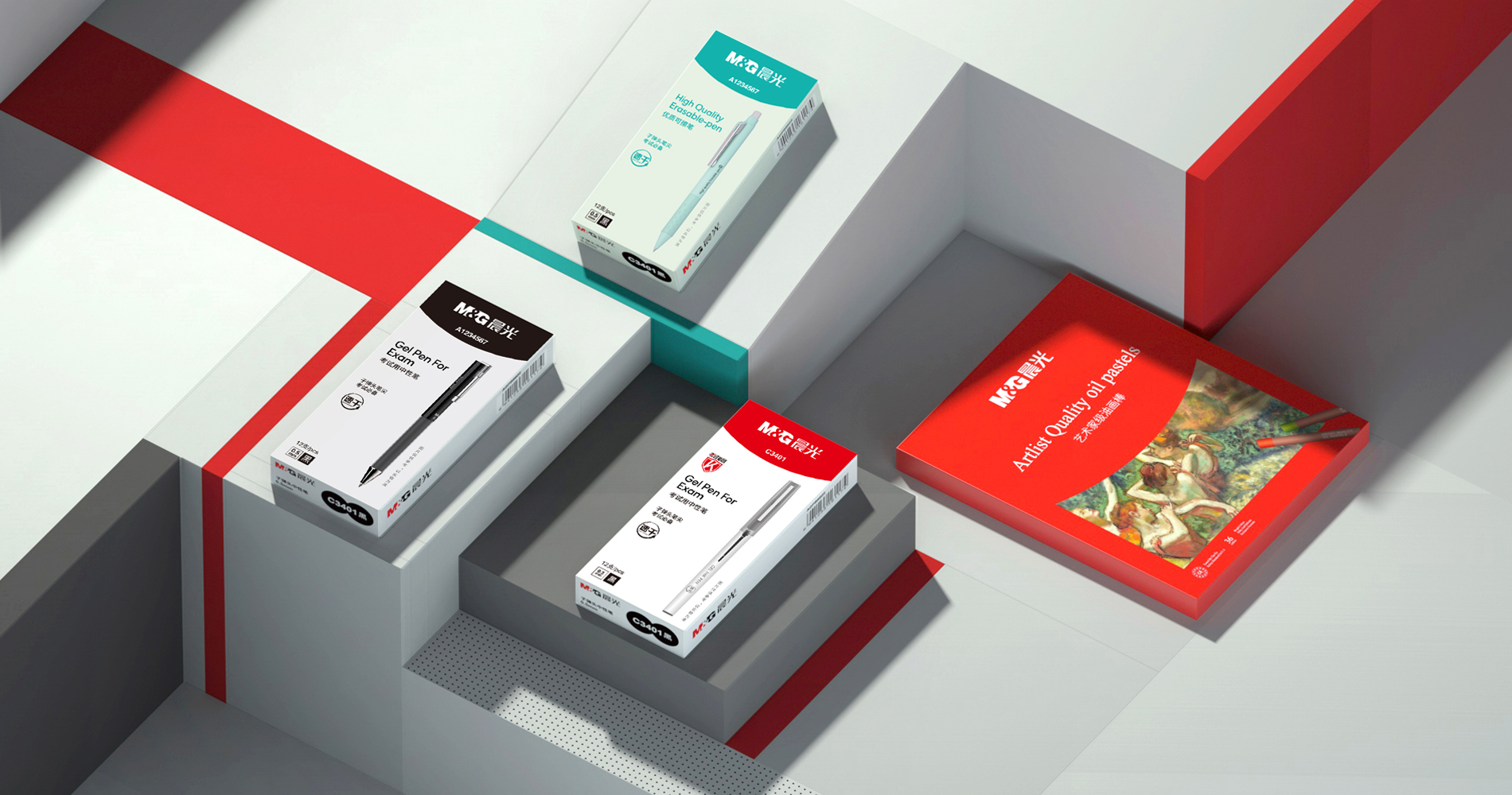
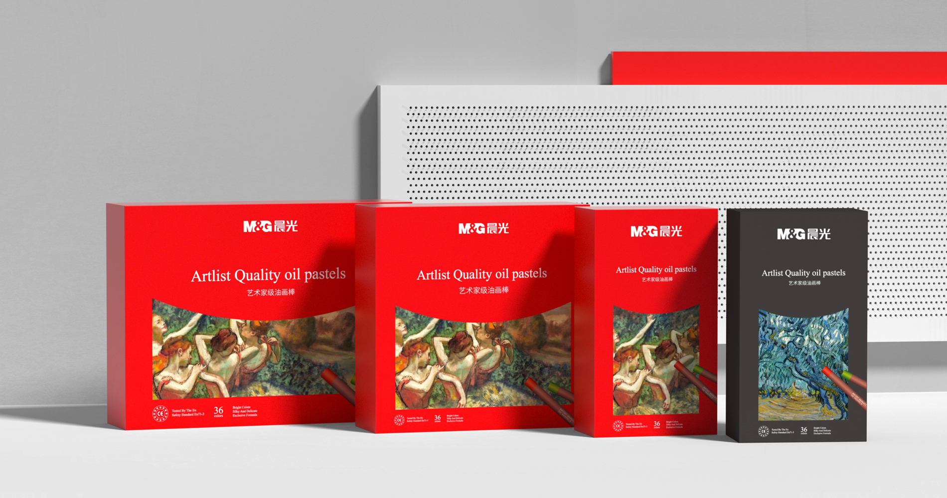
基于“打造世界級M&G”的愿景,“讓學習和工作 更快樂,更高效”的使命,我們針對M&G內部8個事業部進行了多輪訪談,經過半年時間,把M&G的愿景和使命融入到產品包裝和推廣物料中,采取了一致性的視覺語言統一品牌認知,講述一個有意義且具有一致性的故事。
Strategy
We conducted multiple rounds of interviews with eight internal divisions of M&G based on the vision of "building a world-class M&G" and the mission of "making learning and working happier and more productive." After six months, we integrated the vision and mission of M&G into product packaging and promotional materials, adopting a consistent visual language to unify brand perception and tell a meaningful and consistent story.
解決方案
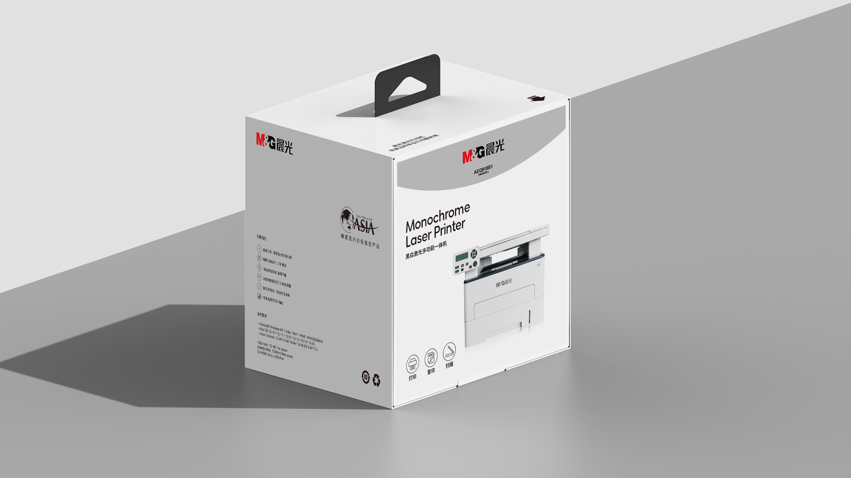
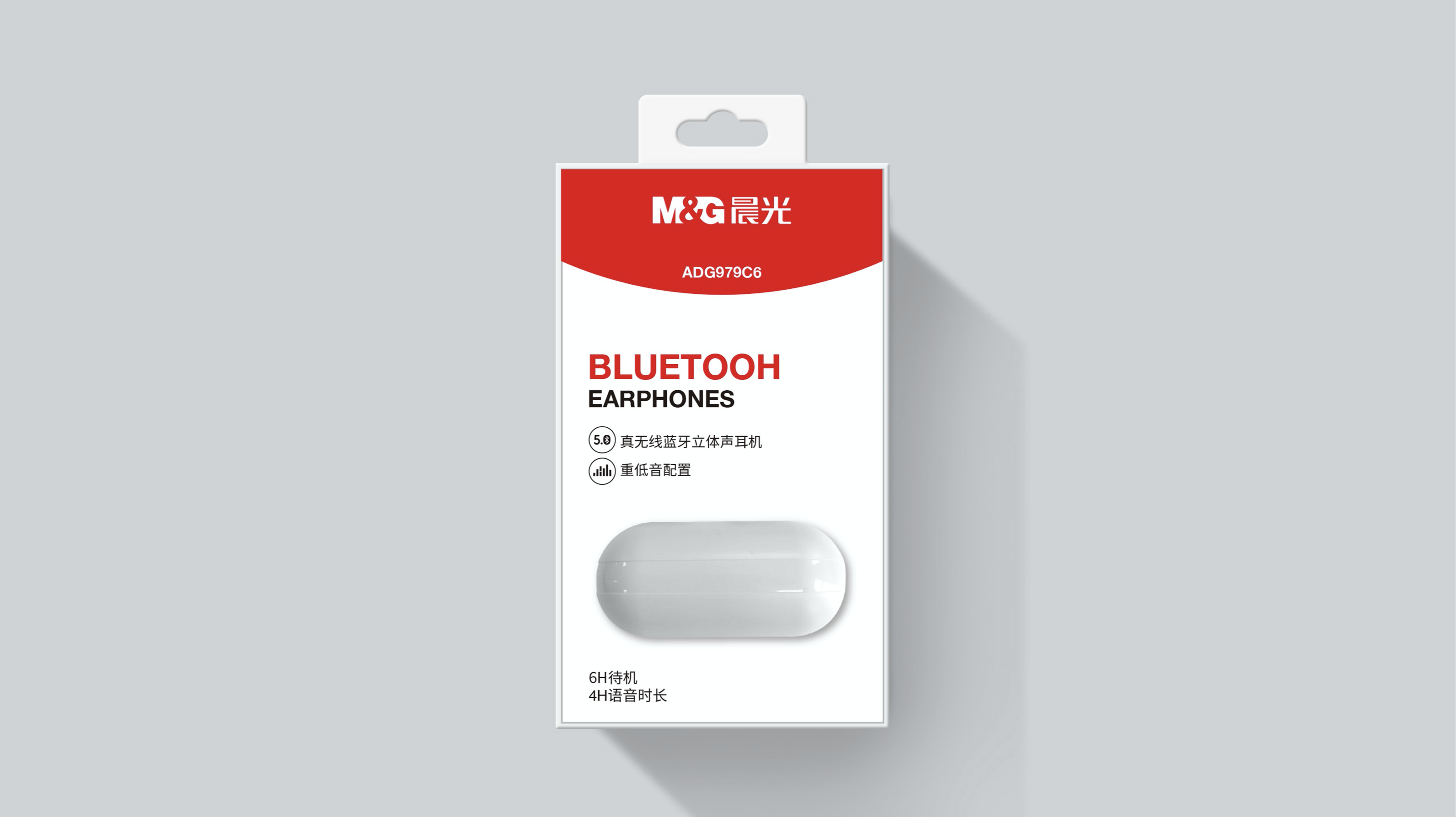
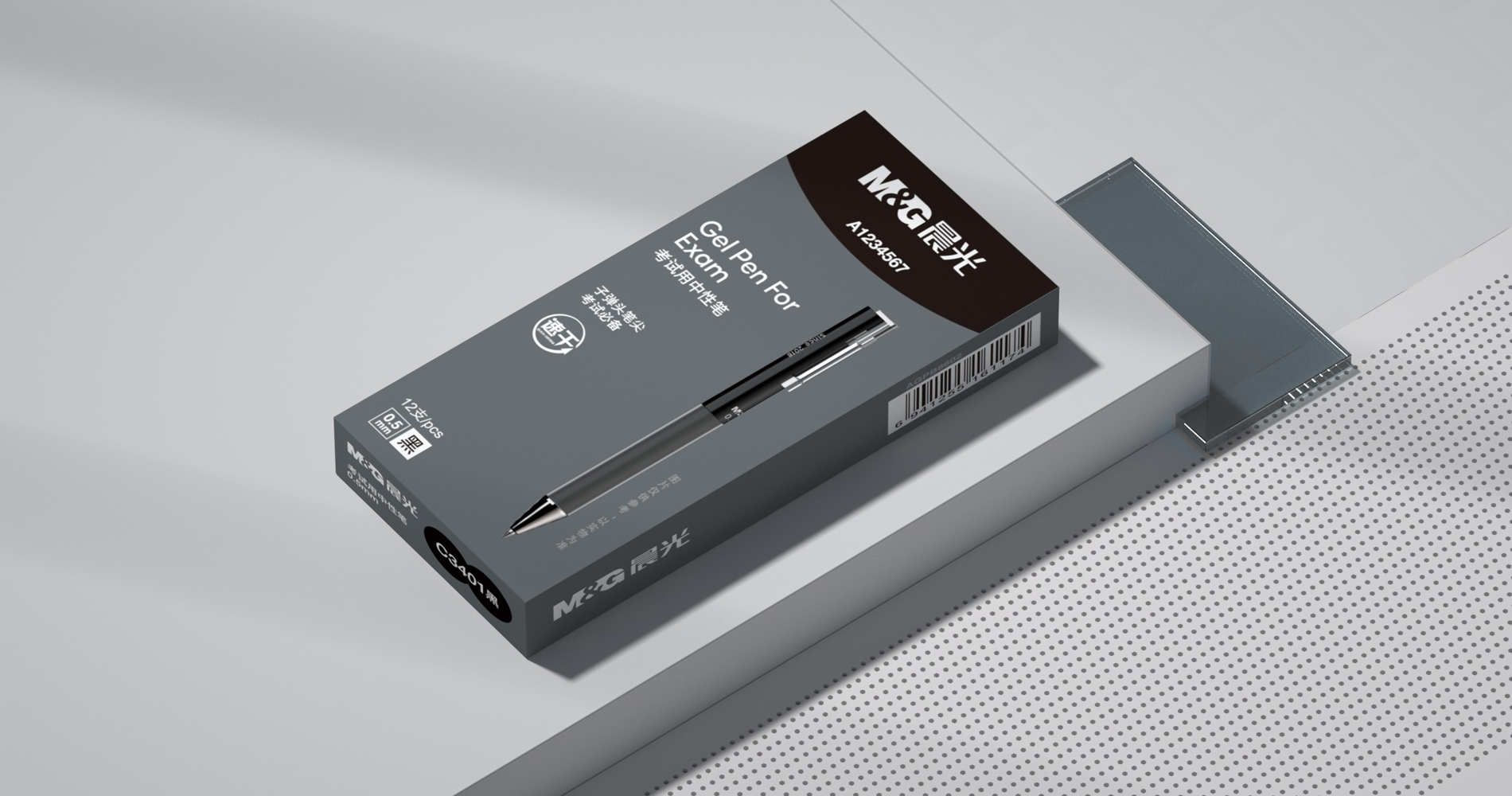
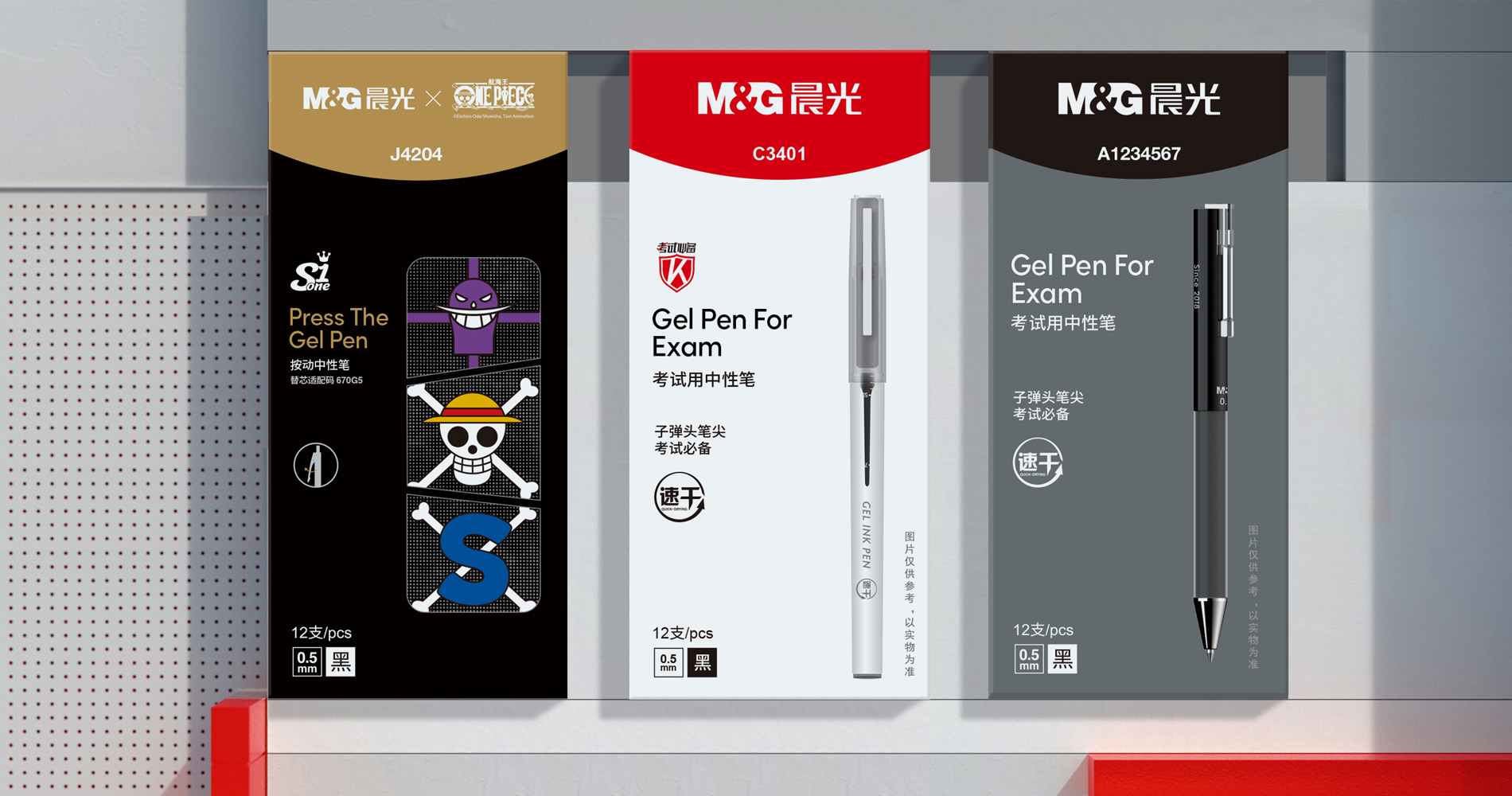
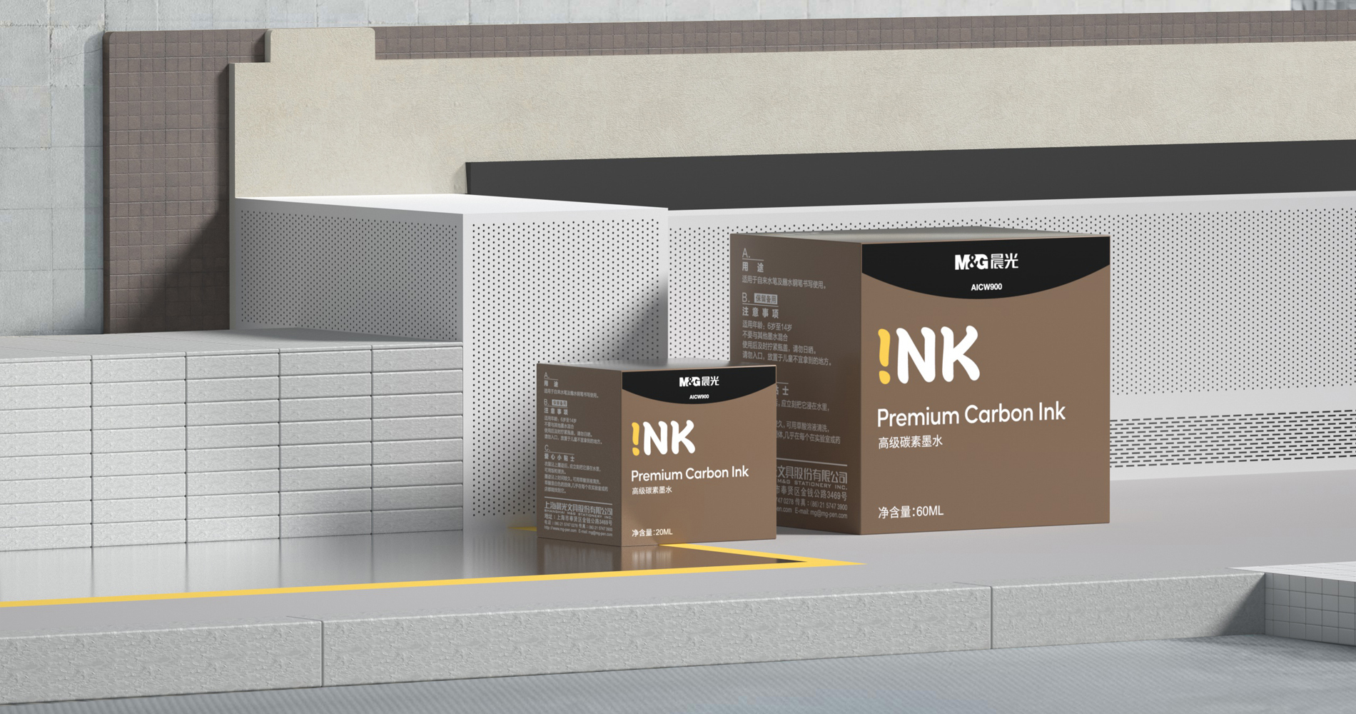
要打造世界級M&G,本身M&G的logo 在包裝中顯的尤其重要。從長期的視覺資產來看logo是M&G的優勢,它需要被強化識別,需要放在最顯眼的位置。在創意概念上也需要找尋一個和所有人產生共情的方式,我們選取了太陽升起的一條地平線和微笑的一個弧度作為整體包裝體系和推廣體系的語言作為核心創意和logo一起呈現,它體現了晨光中文的含義:Morning Glory,也體現了使命中關于快樂的描述。
我們期待用一種更簡單的方式來串聯他們所有的視覺接觸點,以一種更整體和更簡單直接的方式體現他們的宏偉愿景。 在幾萬個SKU中建立規則是一個復雜工程,晨光的產品從5CM的橡皮擦到1米的科技產品包裝,從辦公文具、兒童文具、醫療用品、教學道具、科技產品,在尺寸和品類上都具有較大跨越,為了呈現的一致性,我們測算了一種計算公式,可以簡單的4個步驟即可得到一致性的產出,方便內部管理和輸出。
Idea
From a long-term visual asset standpoint, M&G's strength is its logo, which should be prominently displayed for global consumers to quickly recognize. We needed to find a way to sympathize with everyone in terms of the creative concept. The language of the overall packaging system and promotion system, which embodies the meaning of Morning Glory in Chinese: Morning Glory, and the description of happiness in the mission, was chosen as the core idea to present along with the logo, which embodies the meaning of Morning Glory in Chinese: Morning Glory, and the description of happiness in the mission.
We hoped for a more straightforward and comprehensive way to connect all of their visual touch points in a way that reflected their grand vision. Developing rules for tens of thousands of SKUs is a difficult task. M&G's products come in a variety of sizes and categories, ranging from 5CM erasers to 1m packages of technology products, and include everything from office stationery to children's stationery, medical supplies, teaching props, and technology. For easy internal administration and output, we measured a calculating method to get consistent output in four simple steps for consistency in presentation. Results
結果
以包裝為主體的品牌視覺更新解決了M&G產品的主要問題,方便渠道商快速的識別品牌特征,也協調了內部8個事業部的行動,使其內部管理更為高效,配合晨光的一系列推廣及活動,我們相信晨光走向全球品牌邁出了關鍵一步。
Results
The packaging-based brand visual upgrade addresses M&G's primary issues, enables channel operators to quickly identify brand elements, and coordinates the actions of the company's eight internal business divisions, resulting in more efficient internal management. Morning Glory has taken a significant step toward becoming a global brand, thanks to a series of promotions and activities.
始終堅持打造菁英團隊,保持專業
找最棒的人,做最棒的事
Do The Best